
Rough logo sketches for SmallFarmTalk.com
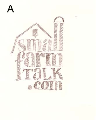
A. Simple translation of the logotype into a barn. The double "L's" in "small" make the silo.
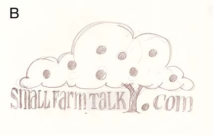
B. Stylized tree (I picture apple tree) gives "homey farm" flavor, and the fallen fruit conveniently produces the 'dot'.
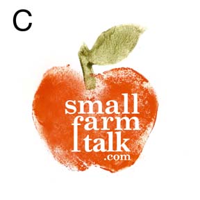
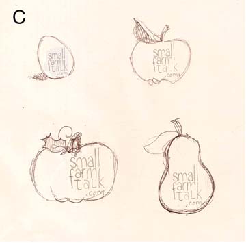
C. I had to do a color comp to get the attitude of this concept accross.Old-fashioned print feel and texture communicates the
"do-it-yourself" attitude of small farmers. I picture a series of logos produced from prints of fruits,
veggies, and other shapes like eggs. This concept also can translate into the buttons.

D A graphic translation of a small barn communicates simplicity in this clean label
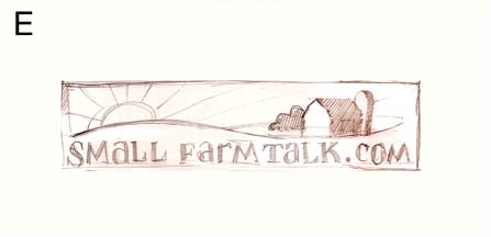
E An approachable illustration of a utopian small farm at sundown is the focal point of this logo. The illustration will feel a bit like a woodcut, reminiscent of wooden signs
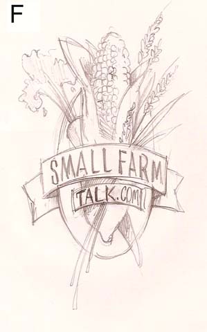
F This logo pays hommage to old flour sack seals. A bit of a cornucopia of produce communicates the variety of farm products and the entire logo provides a flavor of self-sufficiency.

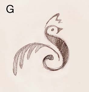
G. I always like to play with letterforms, and I used the initial "S" to illustrate the king of most barnyards: the rooster.
The rooster can be used on its own as well.
I hope there are a couple concepts here that intrigue you.
Take your time and live with them for awhile. I'm available to discuss these at any time. Thank you! Jamie